Tazzy
Year: 2023 / Client: Zoos Victoria
Tazzy is a collaborative project with Zoos Victoria designed to raise awareness about the endangered Tasmanian Devil. This short animation highlights the threats the species faces from habitat loss, disease, and competition, emphasizing the urgent need for increased conservation efforts. Additionally, the project includes an AR experience to engage audiences more interactively and strengthen the call to action.
A major challenge in this project was altering the public’s perception of the Tasmanian devil, commonly viewed as a pest. Our goal was to balance its reputation for ferocity with the creation of a sympathetic and approachable character. This shift is crucial to conveying the urgency of protection needed for the species and to encourage public donations for conservation efforts.
Creative Strategy and Execution

The design of Tazzy softens the animal’s features to make it more appealing and relatable. The storyline focuses on conservation without being overly grim to maintain viewer interest.
Hence, the film combines motion, composition, color, and sound to create a compelling narrative. The AR component allows viewers to interact directly with Tazzy, enhancing the engagement and call to action.
Visual and Creative Elements

One of the key challenges in this project was balancing the Tasmanian Devil’s reputation for being ferocious with the goal of creating an approachable and empathetic character that would resonate with the audience.
The character design of Tazzy draws inspiration from the Tasmanian Devil’s natural appearance, with a predominantly black coat and a whitish breast mark. However, the design was adjusted to make Tazzy more approachable, with a softer, rounder face and expressive eyes that could easily convey a range of emotions.

Style frames – Landscape (Long Shot)
For the landscape’s style framework, I initially employed vector graphics to illustrate the distant view. However, to enhance the three-dimensional effect and add depth when using the camera, I will incorporate additional details into this part of the design

Style frames – Background (close-up shots)
In the close-up shots, the imagery will be simplified compared to the long shots. This approach is intentional, as it places greater emphasis on the character or object animation, ensuring that the viewer’s attention is drawn to the key elements of the scene. Aligning with the overarching theme of ‘care’ in the animation, I aim for the action effects to embody a ‘chill Lofi’ style—tranquil and serene, to evoke a sense of calm and peace.
Technical Approach and Innovation
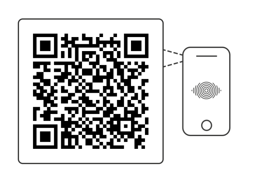
To maximize the film’s impact, I designed the final scene to include a call-to-action that utilizes AR technology. This scene not only features a URL but also doubles as an interactive poster. Through AR, the audience can engage directly with the content, leaving a memorable impression and facilitating easy access to the donation website.


Credit
Created by Zoechu
Music by Bensound.com/free-music-for-videos
License code: RRCV4BY6C3SGSJTB
